
Introduction: First Impressions Matter—Make Them Count
In digital marketing, your landing page is often the first impression a potential customer has of your brand. So, if you’re struggling with low sign-ups or sales, it might not be your product—it could be your page. Knowing how to create landing pages that convert can completely change your results.
Landing pages serve a single, focused purpose: to convert visitors into leads or customers. Whether you want them to sign up, buy, book, or download, every element on the page must work toward that goal. Fortunately, even beginners can learn to craft high-performing landing pages with just a few simple principles. In this blog, you’ll discover the best practices, tools, and secrets behind building landing pages that actually convert.
How to Create Landing Pages That Convert: Start with a Clear and Compelling Headline
Your headline is the first thing people read—and it determines whether they stay or bounce. A converting landing page always starts with a clear, benefit-driven headline. The purpose is to immediately answer the question: “What’s in it for me?”
Here’s how to craft one:
Focus on benefits, not features
Use emotionally powerful words like “free,” “instant,” “simple,” or “exclusive”
Keep it short, ideally under 10 words
Match it to the ad or link that brought the visitor there
For example, instead of saying “Our New Course Is Live,” try “Get Clients on LinkedIn in Just 10 Days.”
In your journey of learning how to create landing pages that convert, remember: your headline isn’t just text—it’s a hook. Moreover, complement the headline with a subheading that reinforces the offer and builds curiosity.
How to Create Landing Pages That Convert: Design with Focus and Simplicity
The design of your landing page should guide your visitor to take action—nothing more, nothing less. One of the most common mistakes is clutter. Too many options, links, or distractions can dilute your message.
Best design practices include:
Use whitespace to direct attention
Stick to one clear call-to-action (CTA)
Keep the layout responsive and mobile-friendly
Use contrast and color to highlight buttons or key areas
Avoid unnecessary links or menu bars
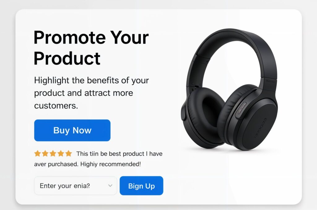
Also, visuals matter. Use one strong image or video that supports your offer—like a mockup of your ebook or a demo of your software. Adding social proof near the CTA (like star ratings or logos of trusted clients) helps build trust. When exploring how to create landing pages that convert, clean design isn’t just about beauty—it’s about removing friction.
How to Create Landing Pages That Convert: Offer Irresistible Lead Magnets
Even the best-designed landing pages won’t work without a strong offer. That’s where your lead magnet or incentive comes in. It must be so valuable that your visitor feels compelled to take action.
Great lead magnets include:
Checklists or cheat sheets
Exclusive video trainings or webinars
Free trials or demo access
Limited-time discounts or bonuses
Personalized quizzes with instant results
Use urgency and scarcity (ethically) to drive action. For example, “Only 100 spots left” or “Free for the first 50 sign-ups.” But always deliver on your promise. Building trust starts with this first exchange. As you’re learning how to create landing pages that convert, never underestimate the power of a targeted and timely freebie.
How to Create Landing Pages That Convert: Optimize Your Call-to-Action
The CTA is the heartbeat of your landing page. Everything else exists to support this one button or action. It should be bold, clear, and specific.
Here are CTA tips that convert:
Use action verbs: “Download Now,” “Get Access,” “Claim Your Spot”
Tell them exactly what they’ll get
Repeat your CTA more than once—top, middle, and bottom of the page
Test different colors and placements to see what gets more clicks
Don’t be afraid to A/B test your CTA. Sometimes changing just one word or color can dramatically improve results. And while it’s tempting to be clever, clarity always wins. That’s a golden rule when mastering
How to Create Landing Pages That Convert: Track Performance and Tweak Constantly
You can’t improve what you don’t measure. Tracking your landing page metrics helps you understand what’s working and what’s not.
Key metrics include:
Conversion rate (% of visitors who take action)
Bounce rate (how many leave without interacting)
Scroll depth (how far down the page people read)
Click-through rate (CTR) on CTA buttons
Use tools like Google Analytics, Hotjar, or your landing page platform’s built-in analytics to gather this data. From there, test one element at a time—headlines, CTA wording, form length, or image choice.
In your process of discovering how to create landing pages that convert, consistent optimization is the secret weapon. Even small changes can produce big wins when applied methodically.
Conclusion: Start Simple, Then Scale What Works
Now you know how to create landing pages that convert—but remember, it’s not about perfection. It’s about action. You don’t need a design degree or coding skills to build something that works. All you need is a clear offer, a compelling message, and a little testing.
Start with one landing page for your top offer or lead magnet. Use a clean layout, strong headline, and one focused CTA. Promote it consistently. Then tweak and improve based on real data.
If you’re serious about growing your email list, generating leads, or selling more products, landing pages are your silent salespeople. Done right, they can run 24/7—bringing in leads while you sleep.
So now that you’ve learned how to create landing pages that convert, are you ready to launch yours?